Hearing & Speech Nova Scotia
Hearing & Speech Services Matter
- Copywriting
- Research & Strategy
- Web Development
- Wireframes & Prototyping
- Content Creation
- UX/UI Design
- Design
- Web Design
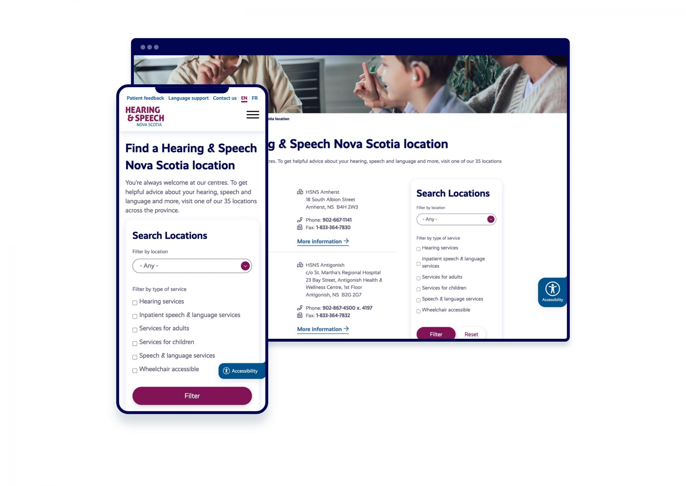
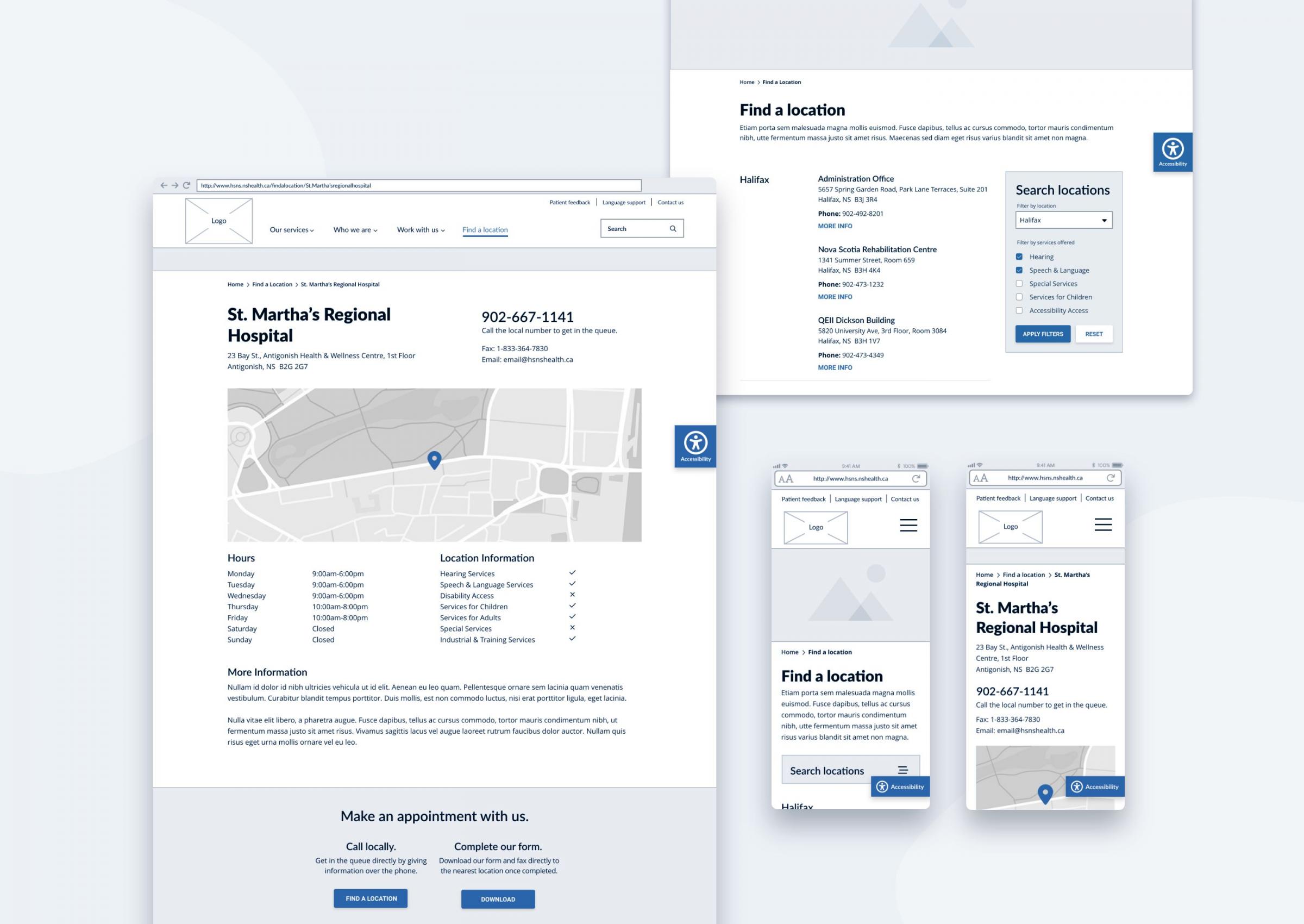
Hearing and Speech Nova Scotia (HSNS) provides critical services throughout the province, employing audiologists and speech-language pathologists across 34 clinical sites and 24 communities. HSNS came to us for help, looking to communicate their services more effectively. We all agreed that a redesigned website would be a pivotal part of their communications plan, to act as a go-to resource, bring in new traffic through search queries, and answer critical questions for patients without requiring on-site visits wherever possible.
The first step was a full-day discovery session, shining light on the unique value HSNS offers the communities they serve. For example, they have recording services for those at End of Life to capture voice notes that loved ones can listen back on. They also provide services to cancer patients experiencing hearing loss due to treatment drugs. By gaining a deep understanding of the client’s services, we were able to ask the right questions to identify our project roadmap.
A key area for improvement was accessibility. Given their wide range of clientele, fixing these concerns was pertinent. Removing patient barriers, engaging the elderly demographic, and creating clear CTAs topped the to-do list.

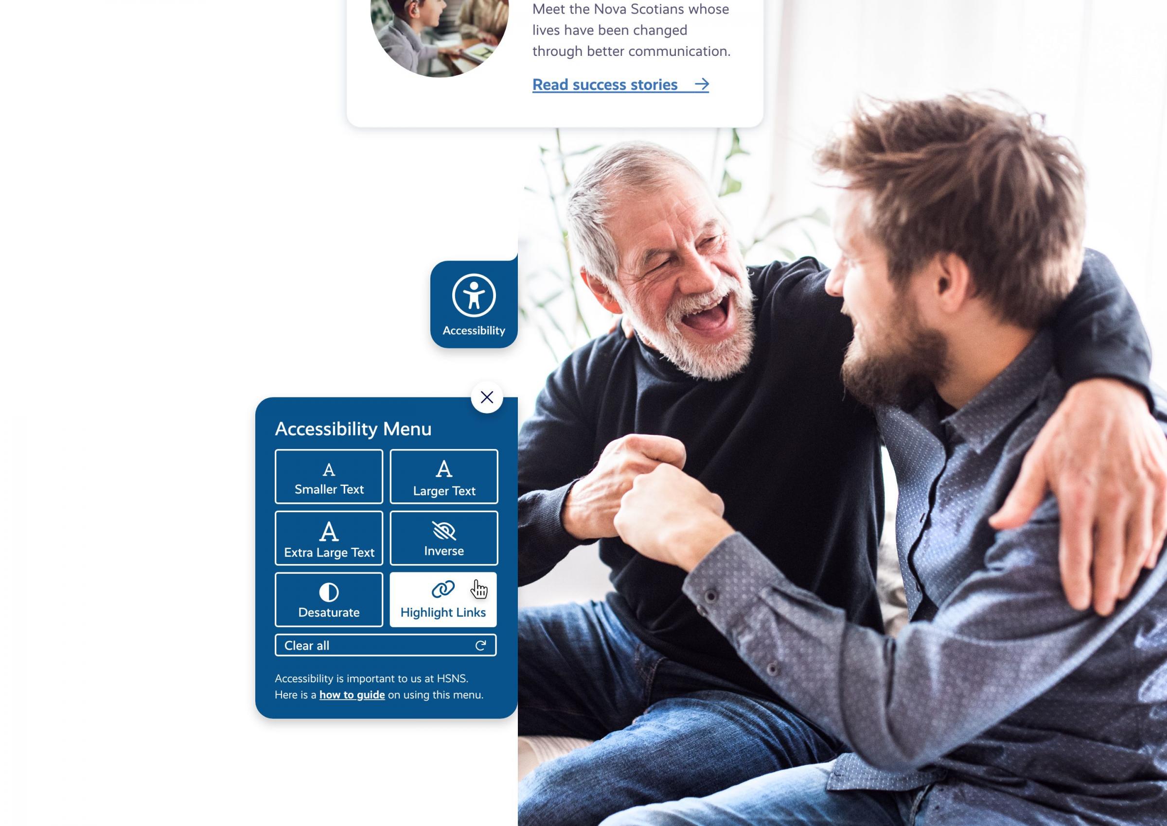
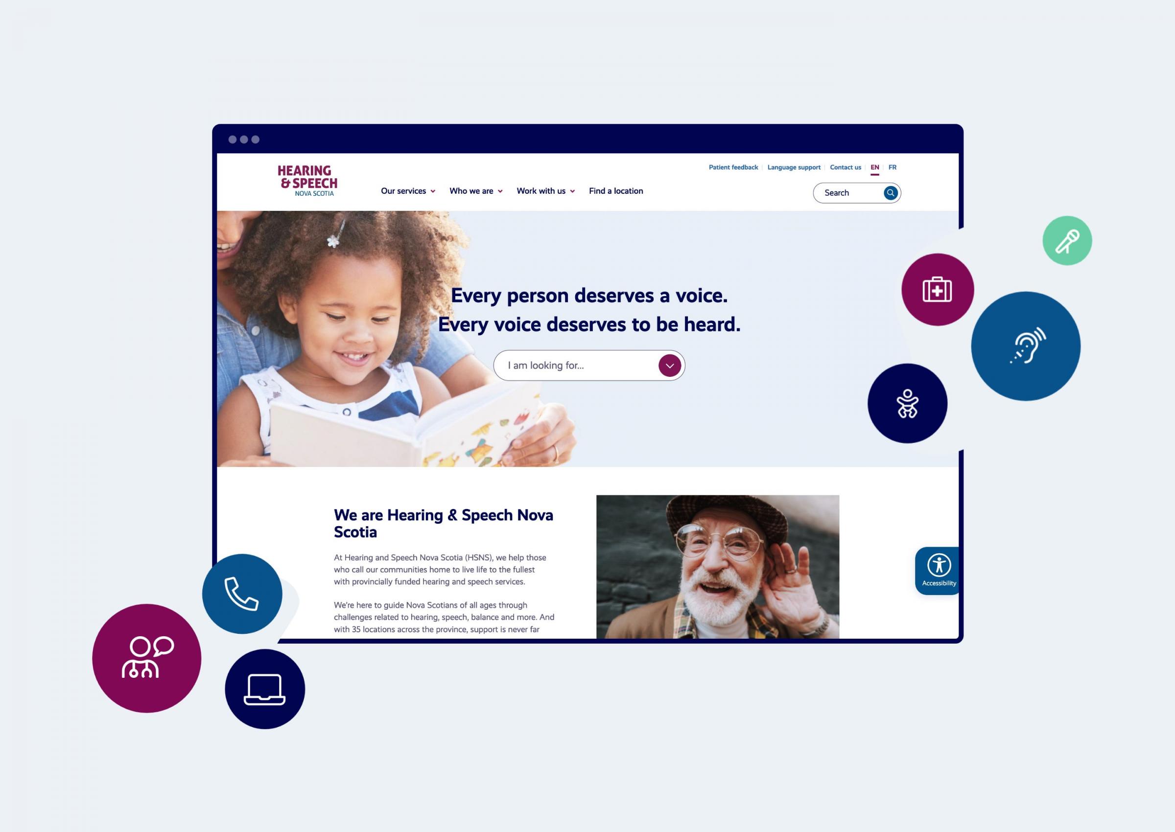
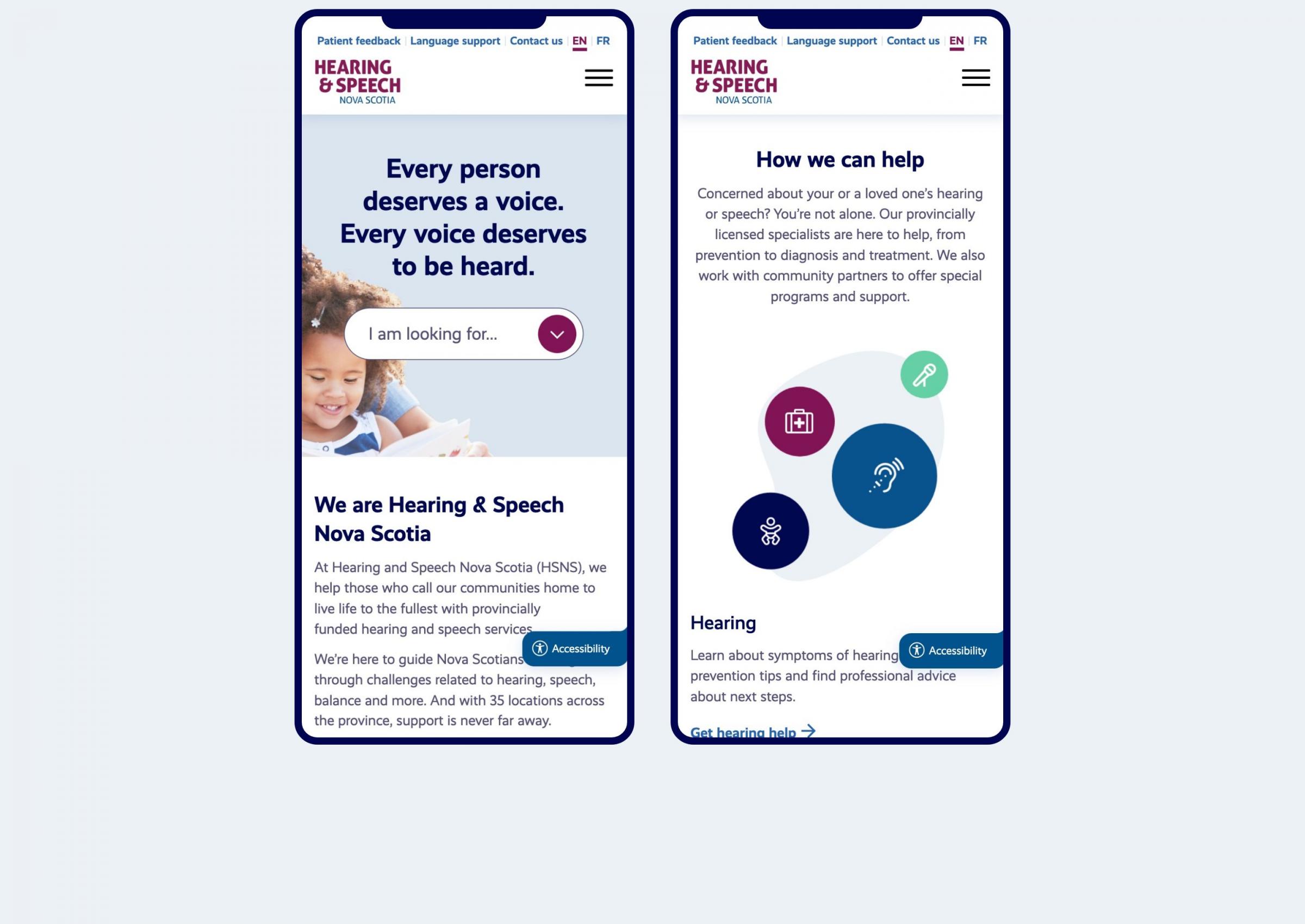
Clients at Hearing & Speech Nova Scotia can now navigate the website with ease, and get more out of the user experience. The homepage greets the user by asking what they are looking for, providing an easy path to the right information. The user can also find what’s offered at their nearest service centre, and gain insight on wheelchair accessibility and parking availability. And newly added Success Stories offer a window into a range of experiences that new and existing clients can relate to. The brand’s look and feel got a facelift too—thanks to a refreshed logo, and pops of colour that guide the user’s eye to the right information.