Killam Apartment Reit
The apartment search, made better
- Copywriting
- Research & Strategy
- Web Development
- Wireframes & Prototyping
- Content Creation
- UX/UI Design
- Web Design
Killam Apartment REIT wanted a better website experience for both their current residents and prospective tenants. The aim was to deliver an optimized journey, seamlessly guiding the user from the curiosity phase to finding that perfect home. We also needed to give people a reason to choose Killam, and current residents a motive to renew their leases.
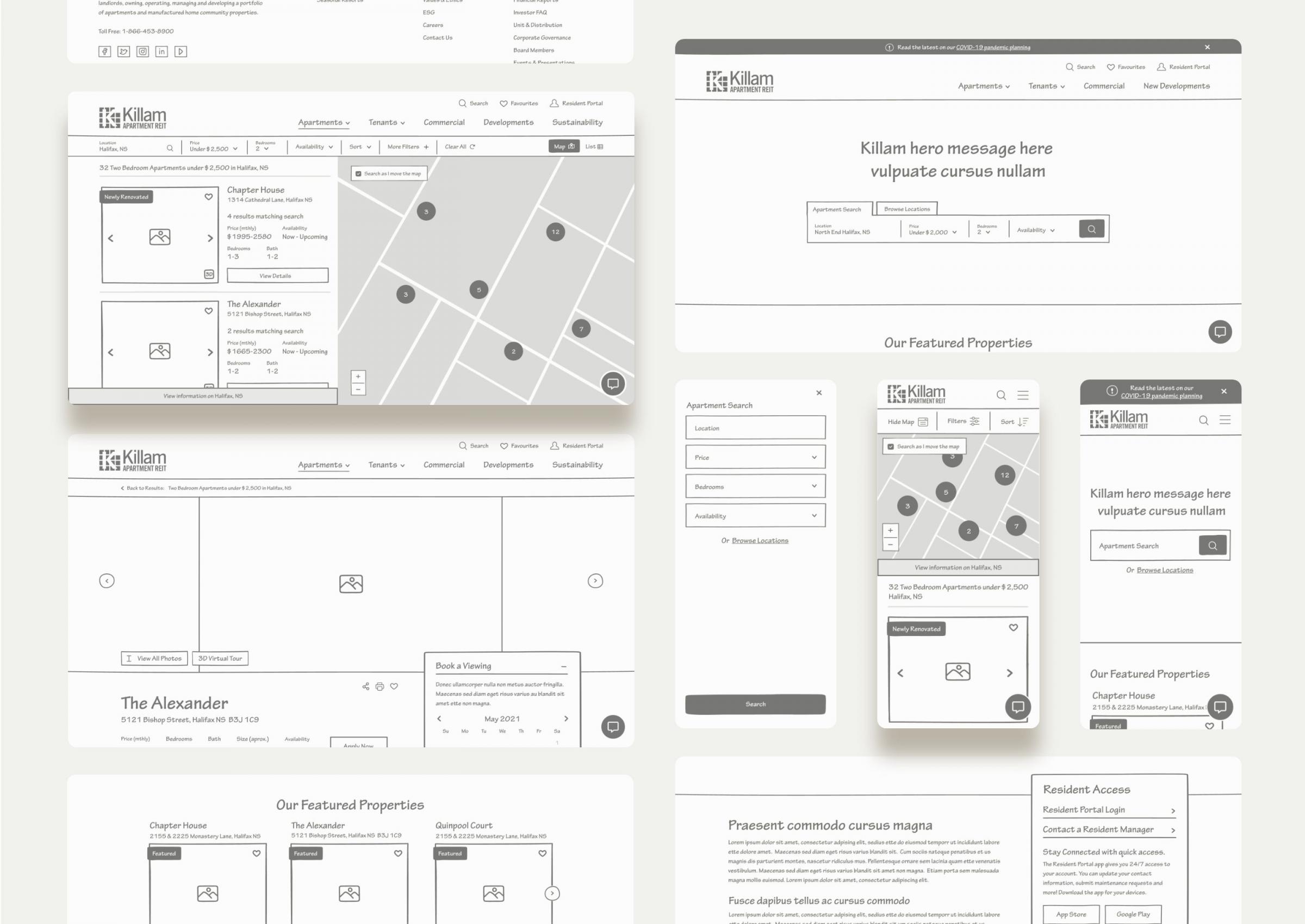
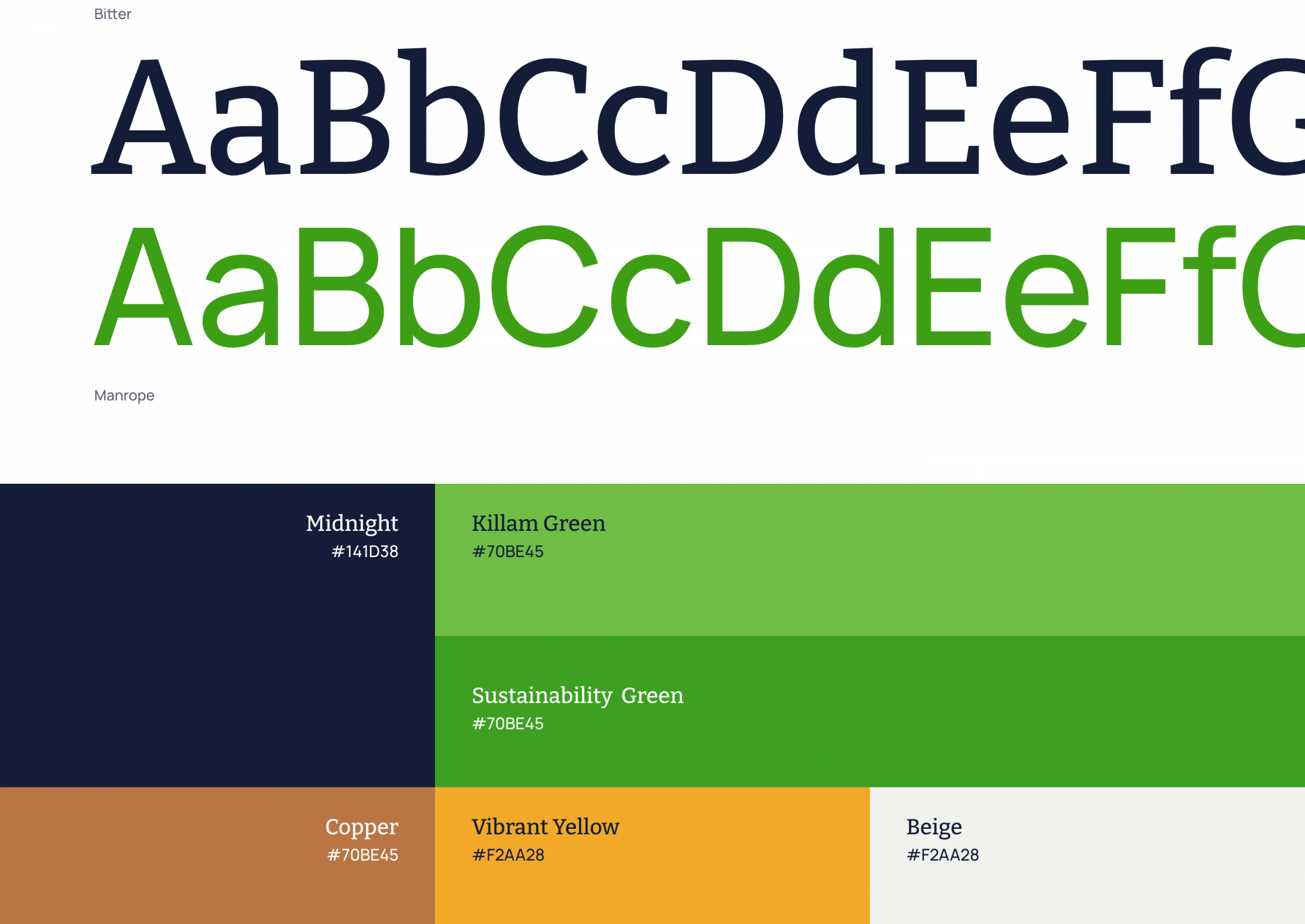
We kicked it off with a mood board to expand brand colours, establishing a look and feel. Next came an overview of the site’s Information Architecture, where we looked for opportunities to improve the customer’s journey. We worked collaboratively with Killam to bring their brand story to life—adding new pages to outline everything from their commitment to sustainability and affordable housing, to the perks of renting from them.


The Outcome
Welcoming residents home
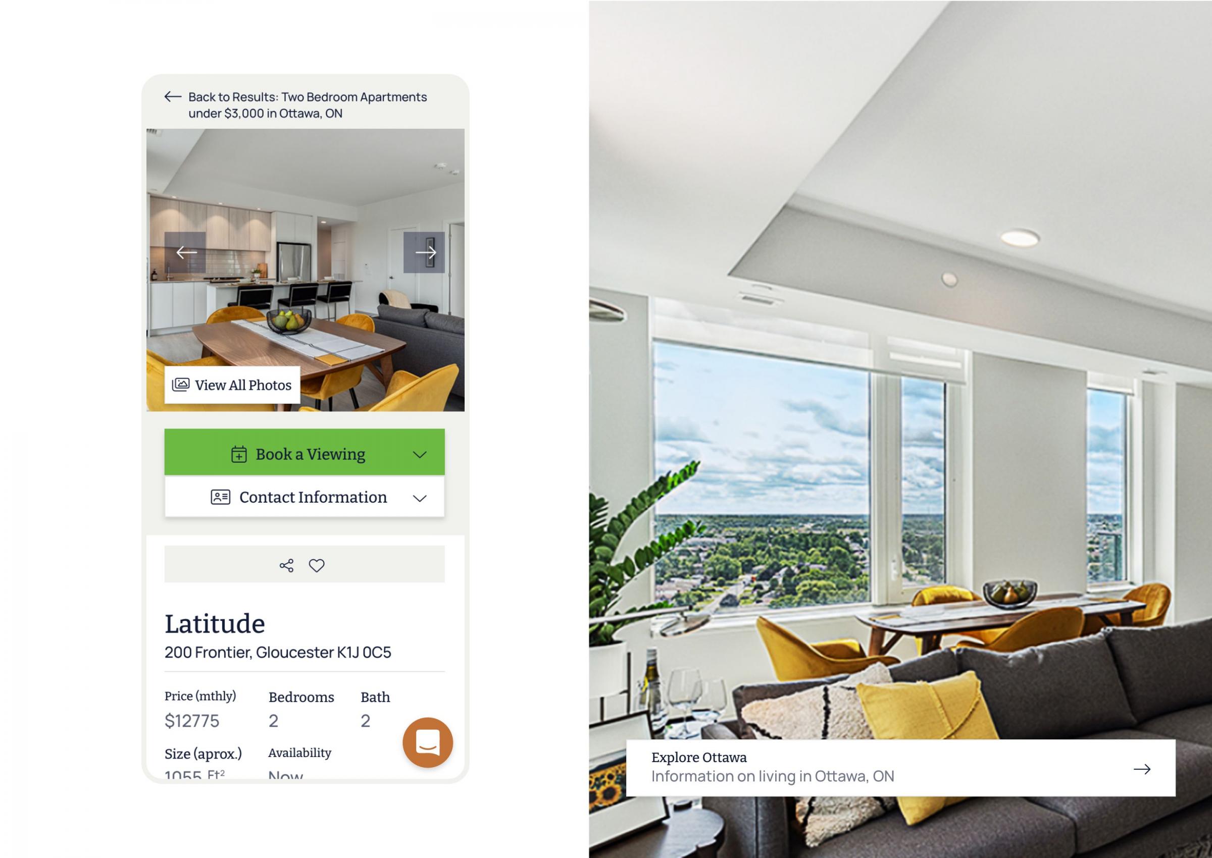
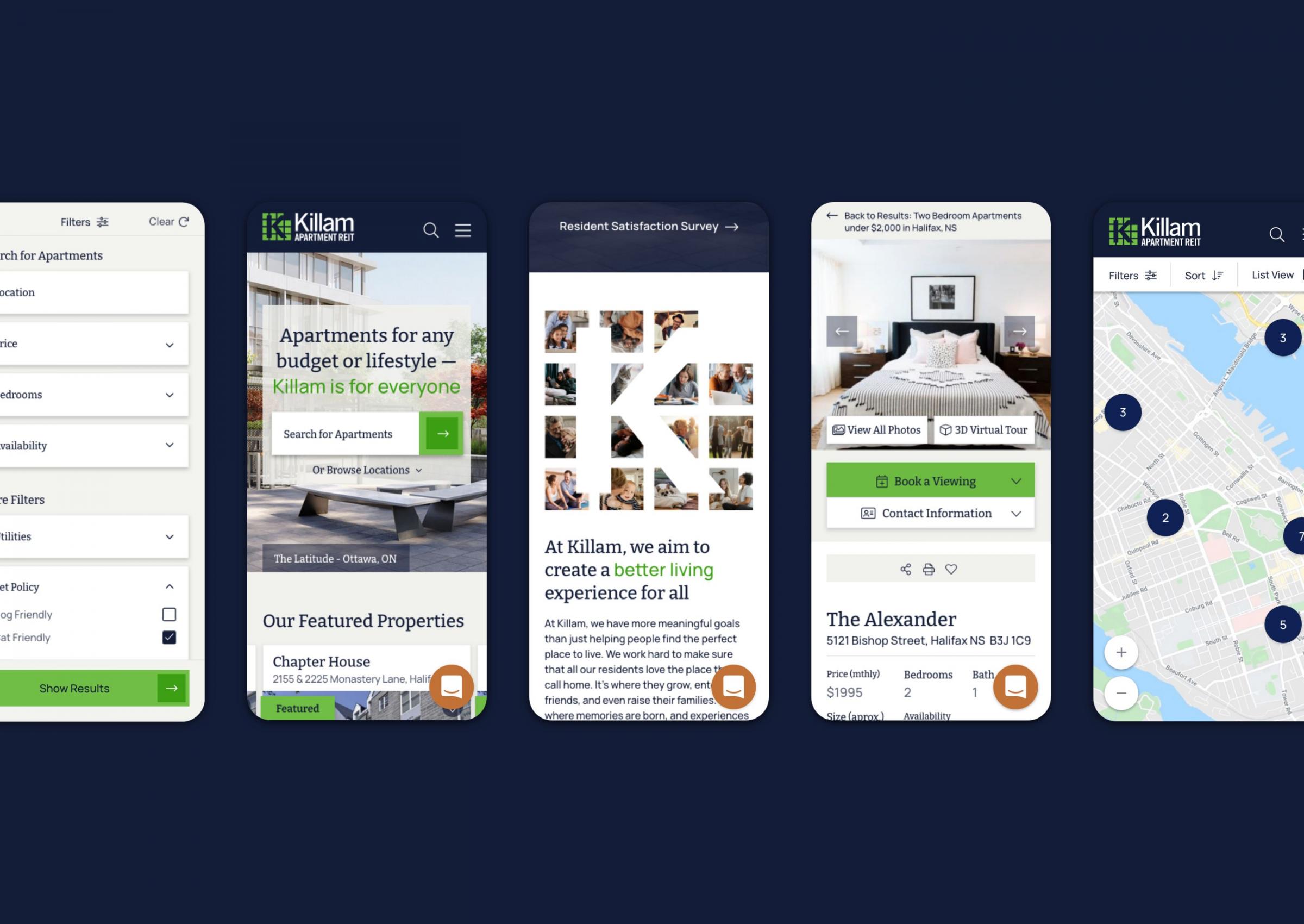
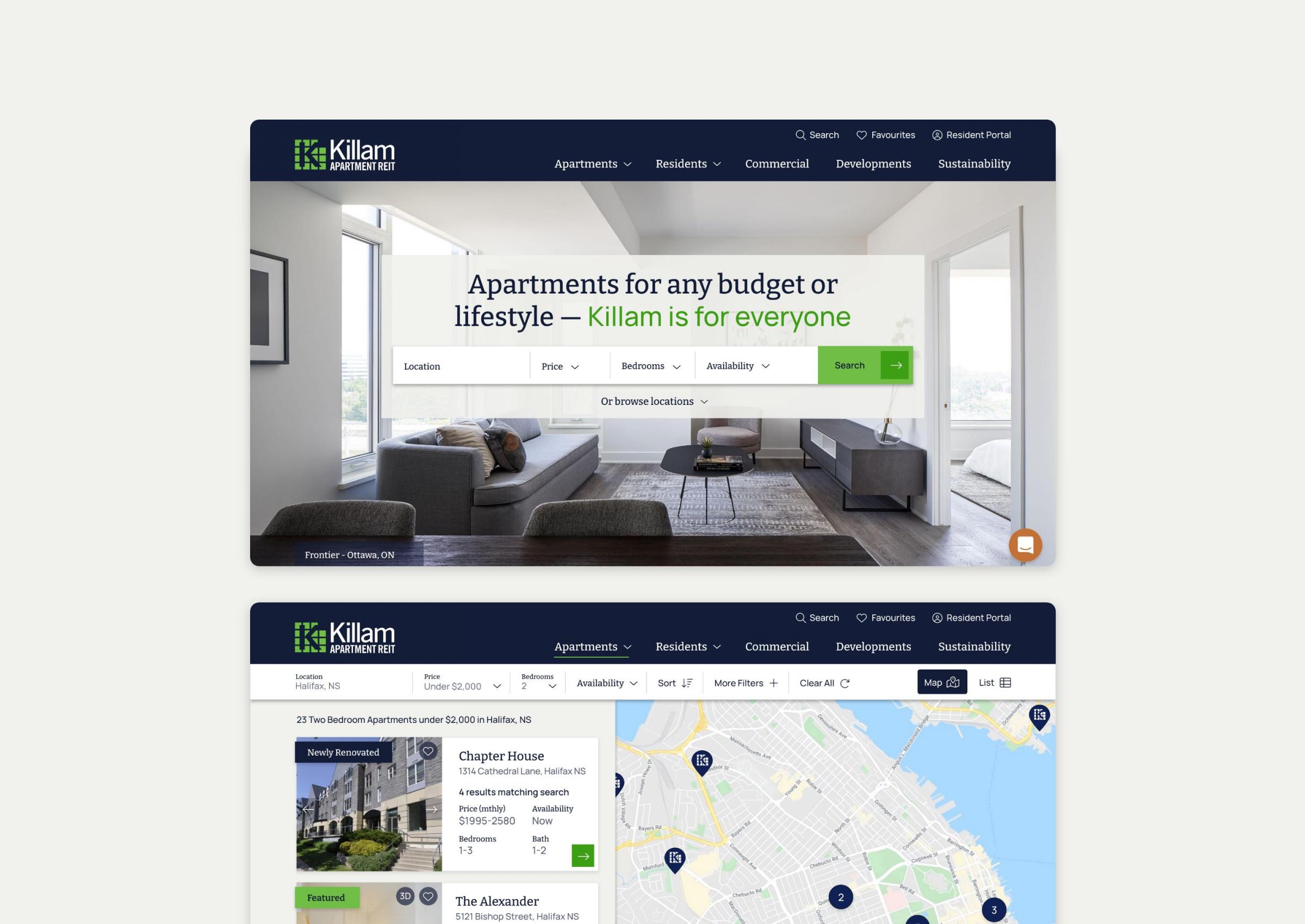
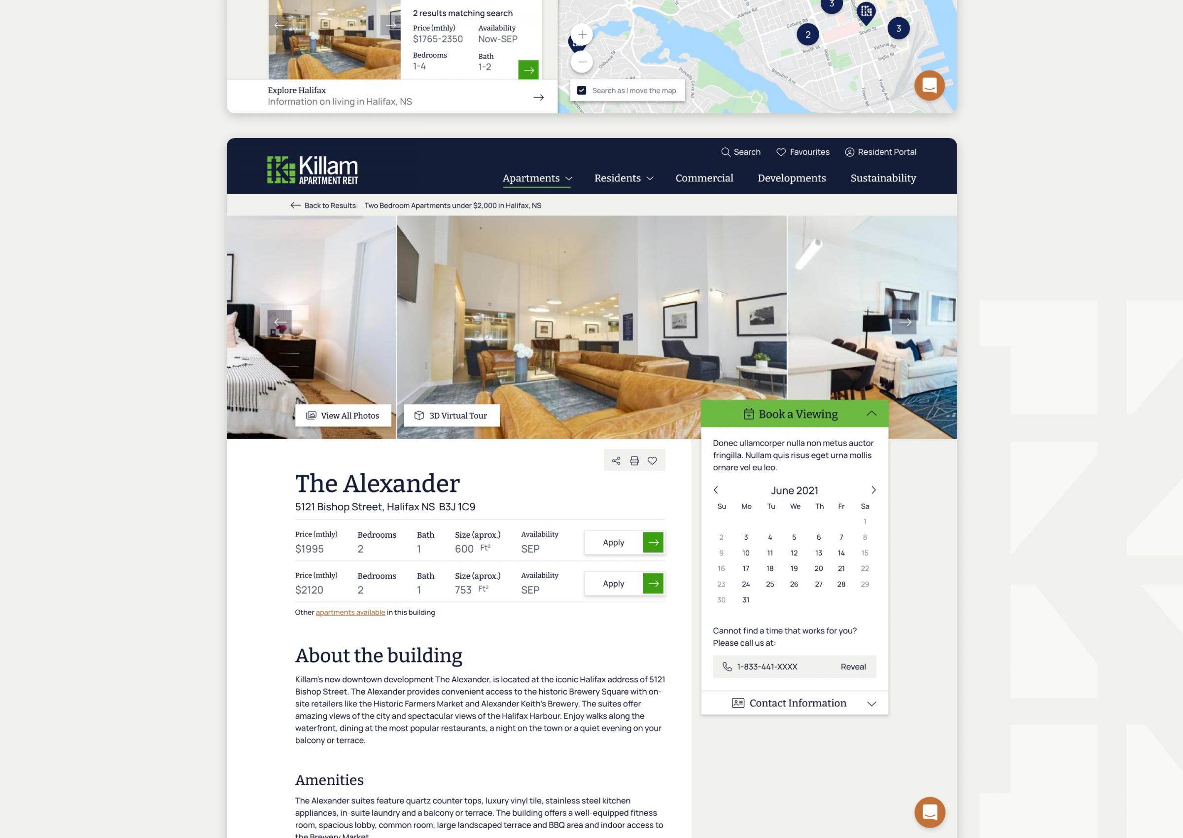
The finished website is a cohesive user journey. Designed for all, the website adheres to accessibility best practices, is mobile-first, and easier to navigate. With improved map functionality and new filtering capabilities like apartment availability and amenities, prospective tenants can find their new homes with ease. A shift from just building pictures to lifestyle imagery allows residents to see themselves living at these properties. Both new and refreshed pages are thoughtfully written to portray Killam’s approach, and are optimized for SEO.

