Community Foundation of Nova Scotia
Helping Nova Scotian Philanthropy Bloom
- Art Direction
- Branding
- Design
The Community Foundation of Nova Scotia (CFNS) is a charitable giving facilitator. For 15 years they have helped donors make sustainable philanthropic impact at the grassroots level.
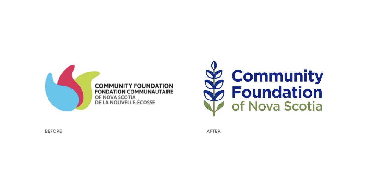
CFNS came to us with a clear strategic vision and outlook but lacking a recognizable visual brand. We needed to develop fresh branding that not only offered clarity and inspired giving in Nova Scotia, but also showed up consistently and credibly across many different platforms, messages, teams, and programs, where messaging and tone could shift drastically.

“When given as a gift, the lupin tells the receiver that a positive outlook leads to new opportunities.”
- FloraQueen

Knowing this new logo would be many people’s first introduction to the CFNS organization it had to immediately reflect the optimism the organization shares with their target audience who are local to Nova Scotia and want to be part of the province’s future.
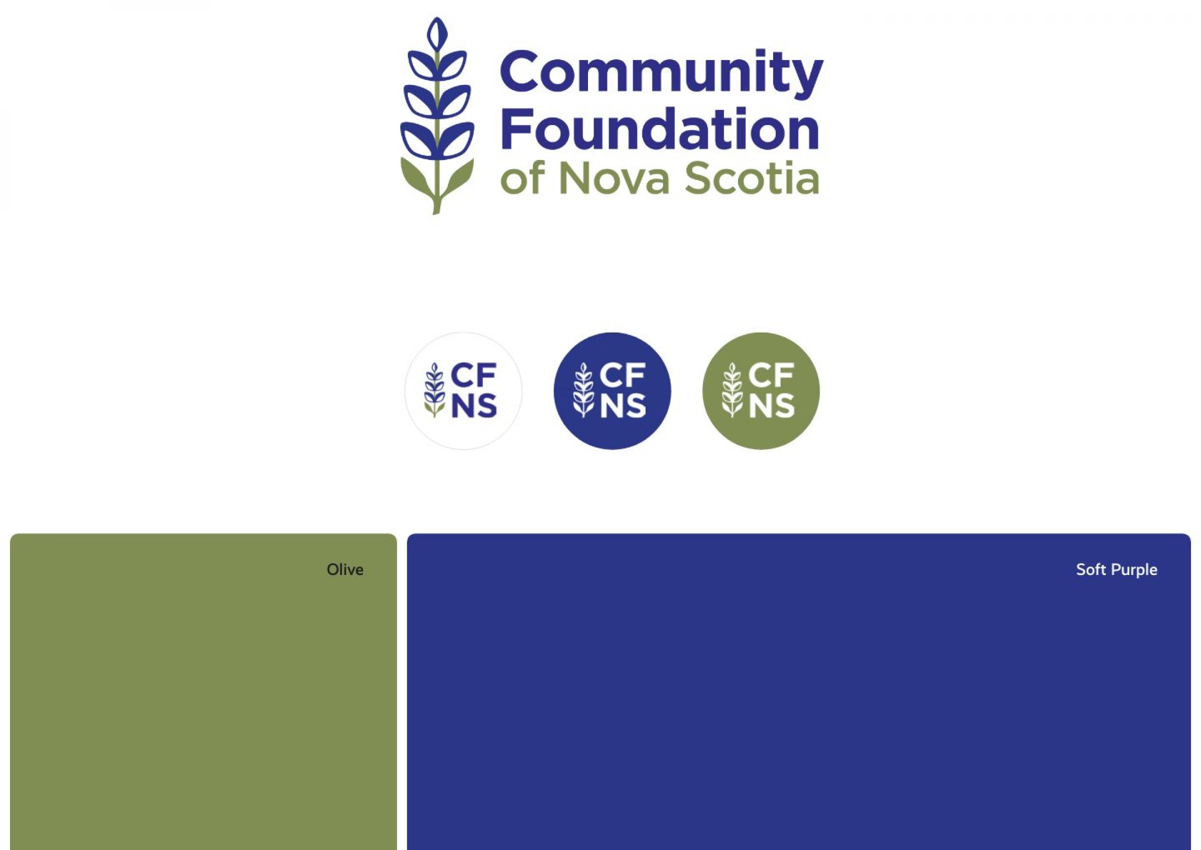
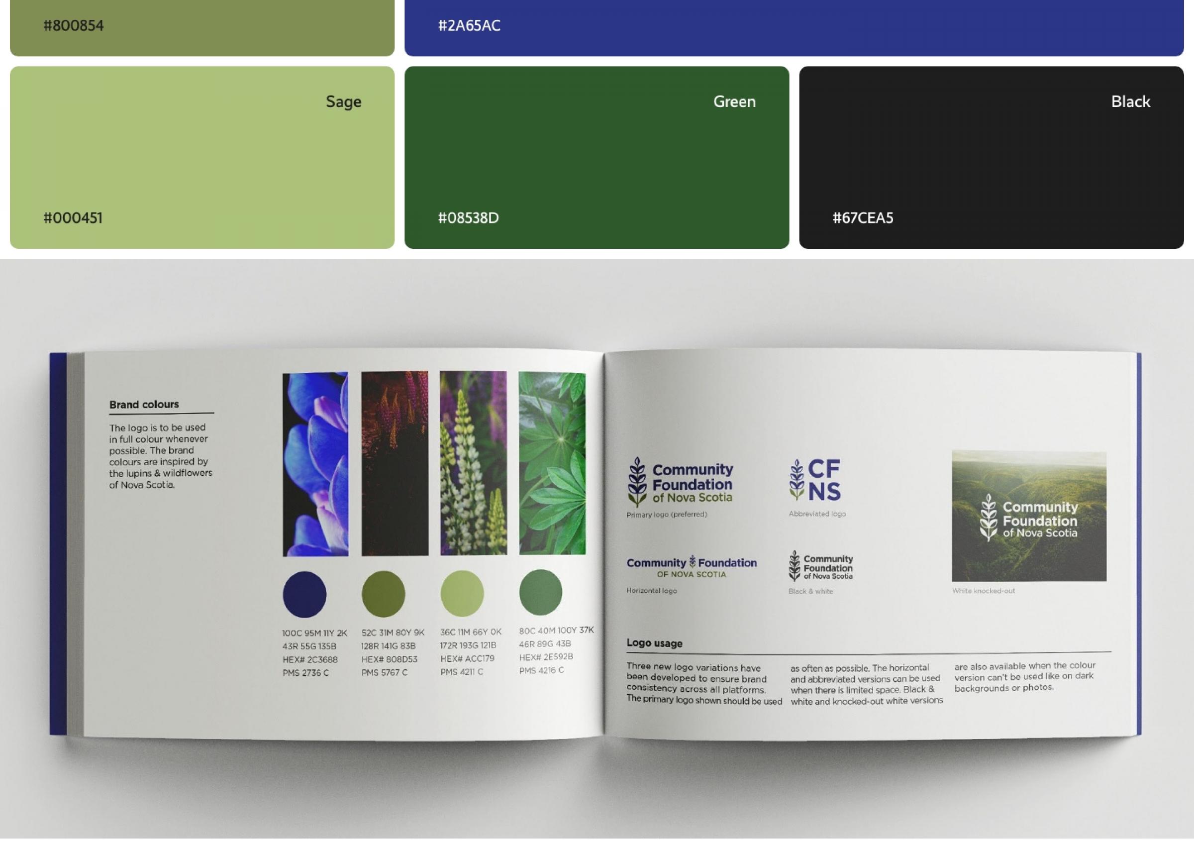
This led us to develop a logo inspired by the lupins and wildflowers of Nova Scotia, something that all Nova Scotians instantly connect to. It is representative of growth, grassroots, sustainability, and community. “When given as a gift, the blue lupin tells the receiver that a positive outlook leads to new opportunities.”
Having multiple factions across Nova Scotia it was vital that the new branding had a system to represent each regional community foundation. We created a simple system that adapted the logo shape and colours unique to each region.


This brand refresh exceeded the expectations of CFNS stakeholders (even bringing some to tears!). The organization is excited to have a usable and clean brand that is now, most importantly, consistent across their communications. The new brand will help grow the CFNS brand, ultimately increasing the donor base and developing more significant impact funds for our province.


