Parkinson Canada
Making new perspectives
possible
- Art Direction
- Research & Strategy
- Branding
- Design
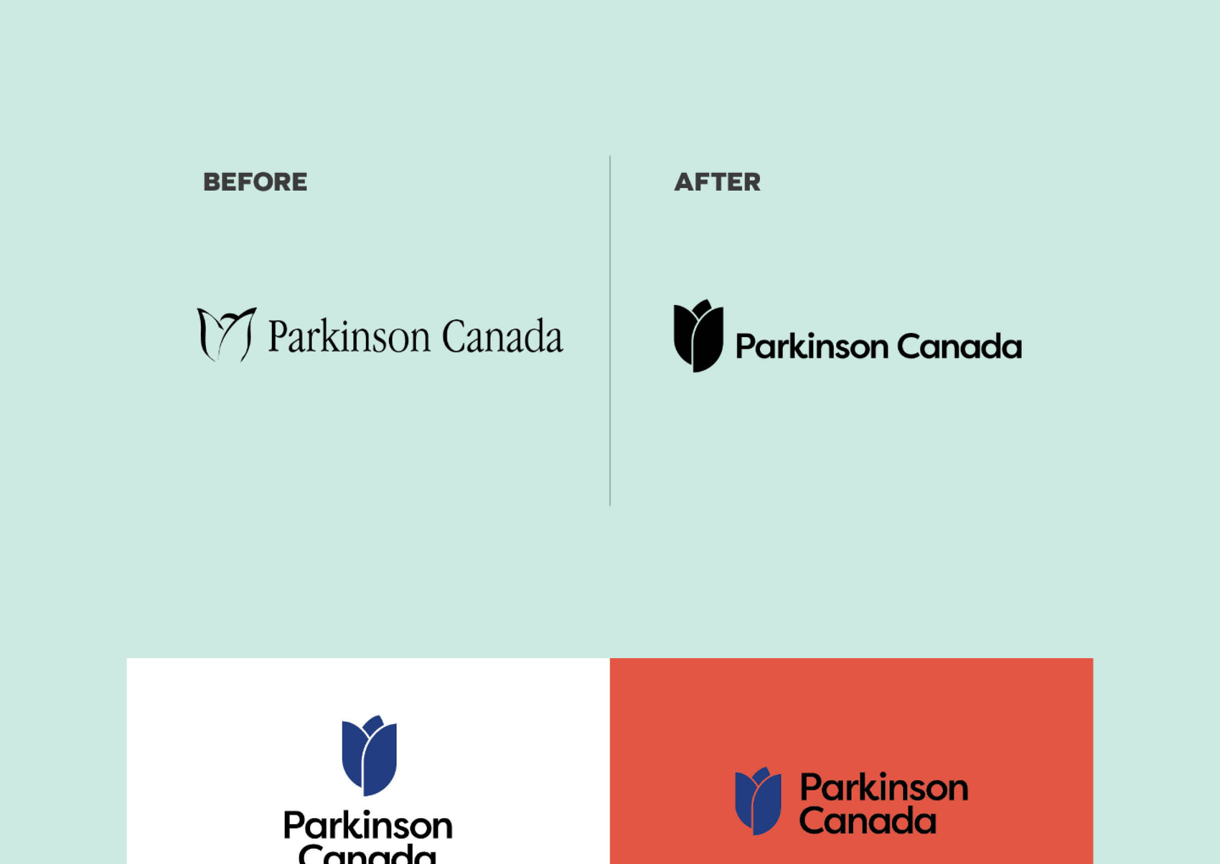
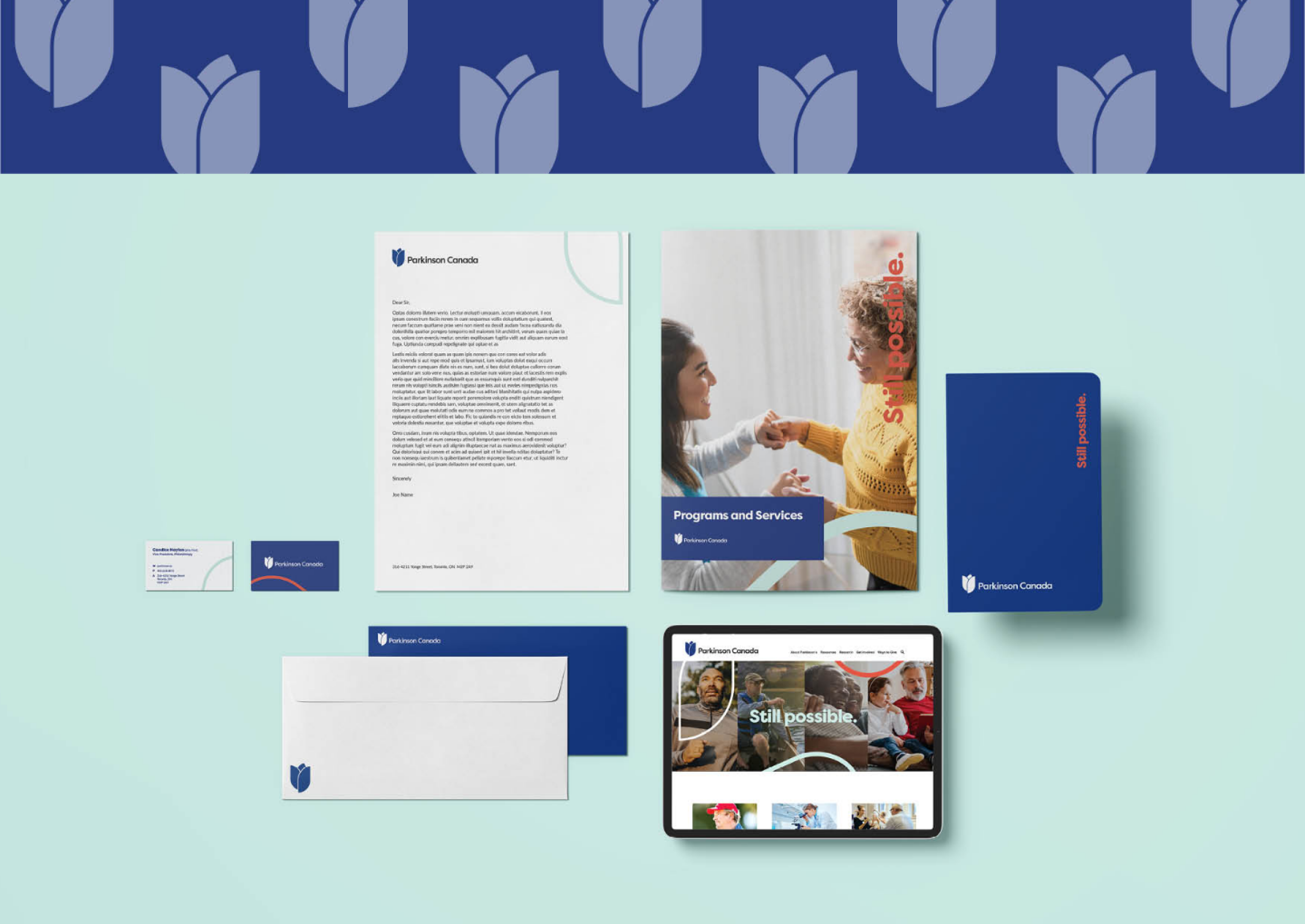
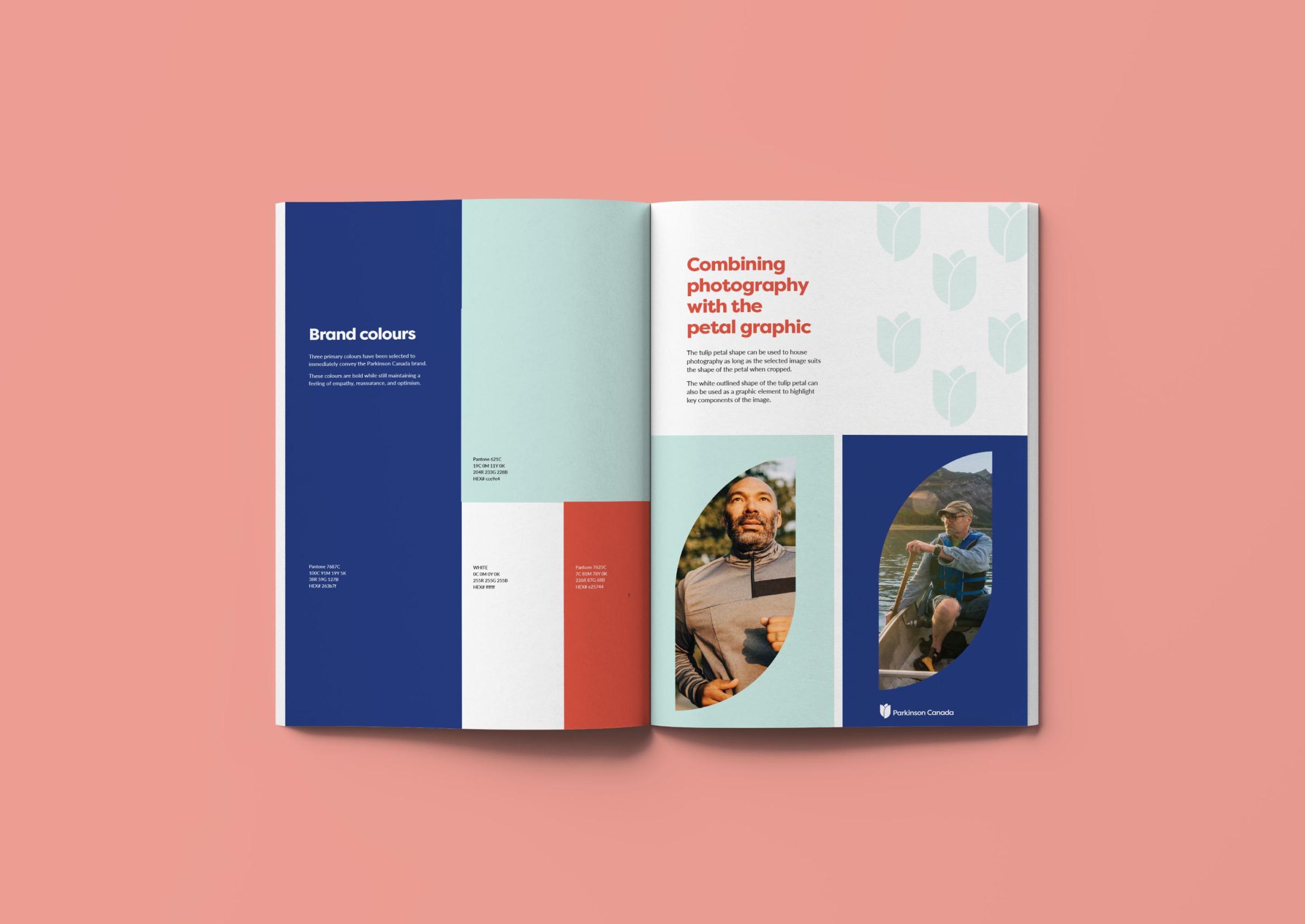
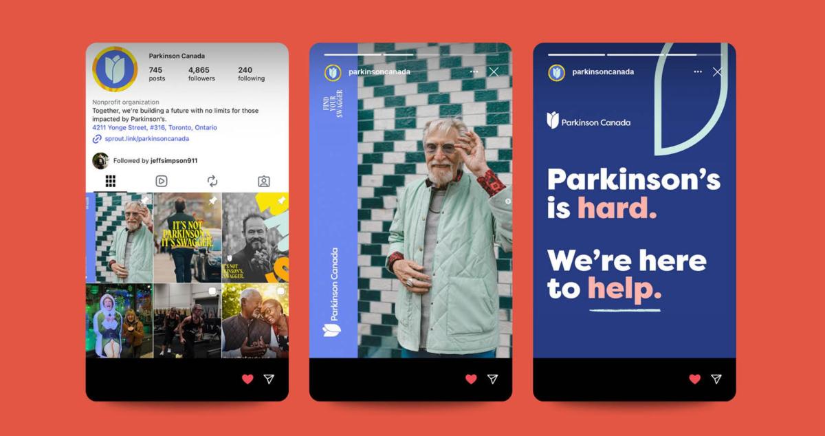
As Parkinson Canada celebrated 55 years of existence, data showed that it reached only about 10% of Canadians living with the disease. Research also showed that the newly diagnosed patients and their families didn’t know what to expect when reaching out to the organization. That’s when Parkinson Canada decided to adopt a new communications strategy. We were tasked with creating a visual identity to match this new language synergically. Not wanting to depart from the tulip—the international symbol for Parkinson—we opted for a redesign of the logo better adapted to the digital age, where shapes in the new tulip could be used as a distinctive visual element on brand content. With these in place, we created a brand identity style guide. Finally, we dug out a powerful (yet underused) piece of messaging that existed within the brand language and positioned it as a core brand element—“Still Possible.” Because with the right support at the right time, anything is.